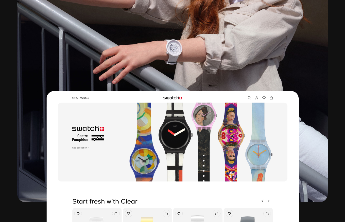
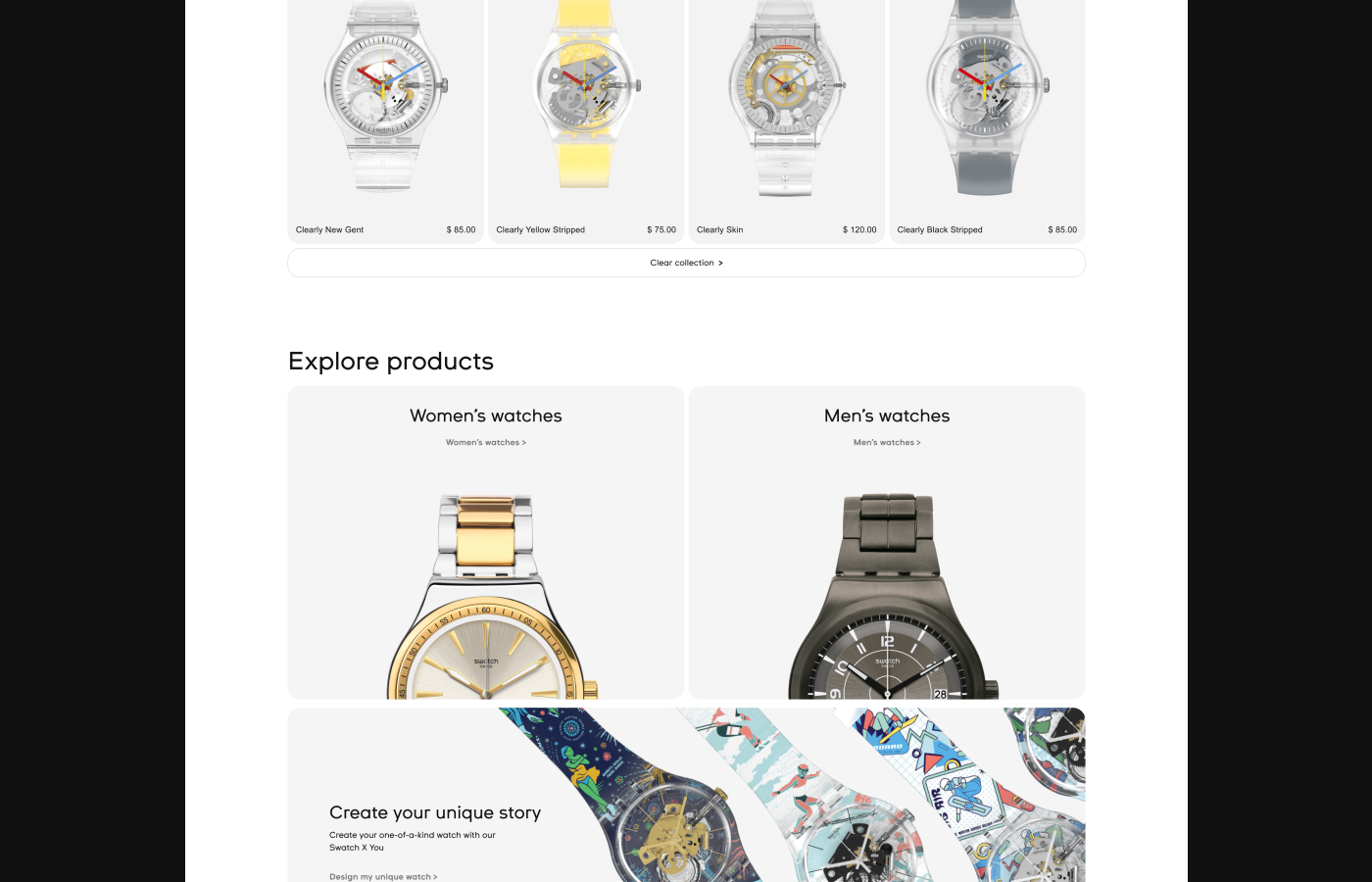
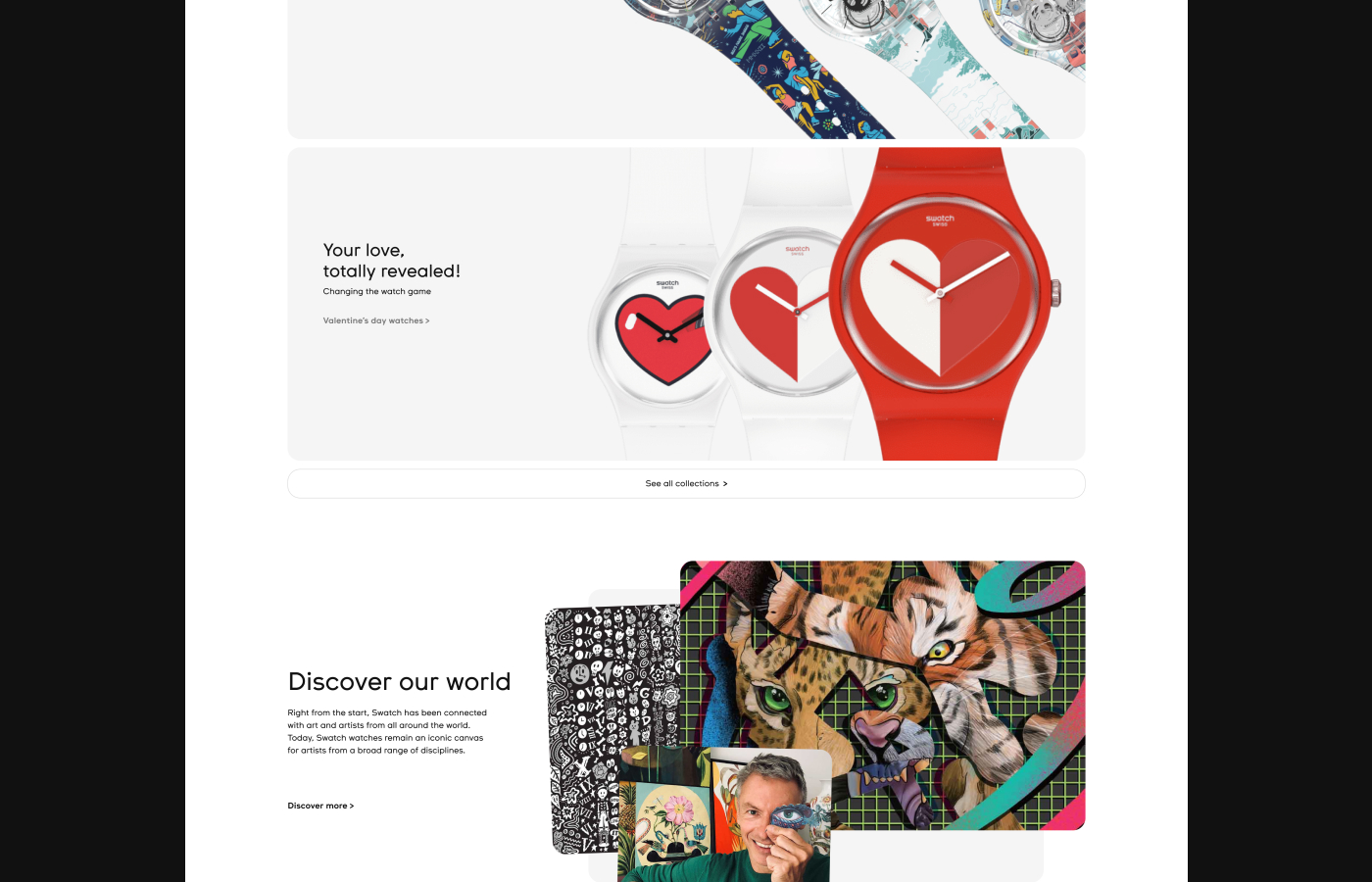
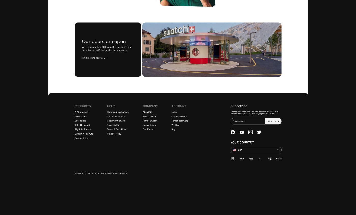
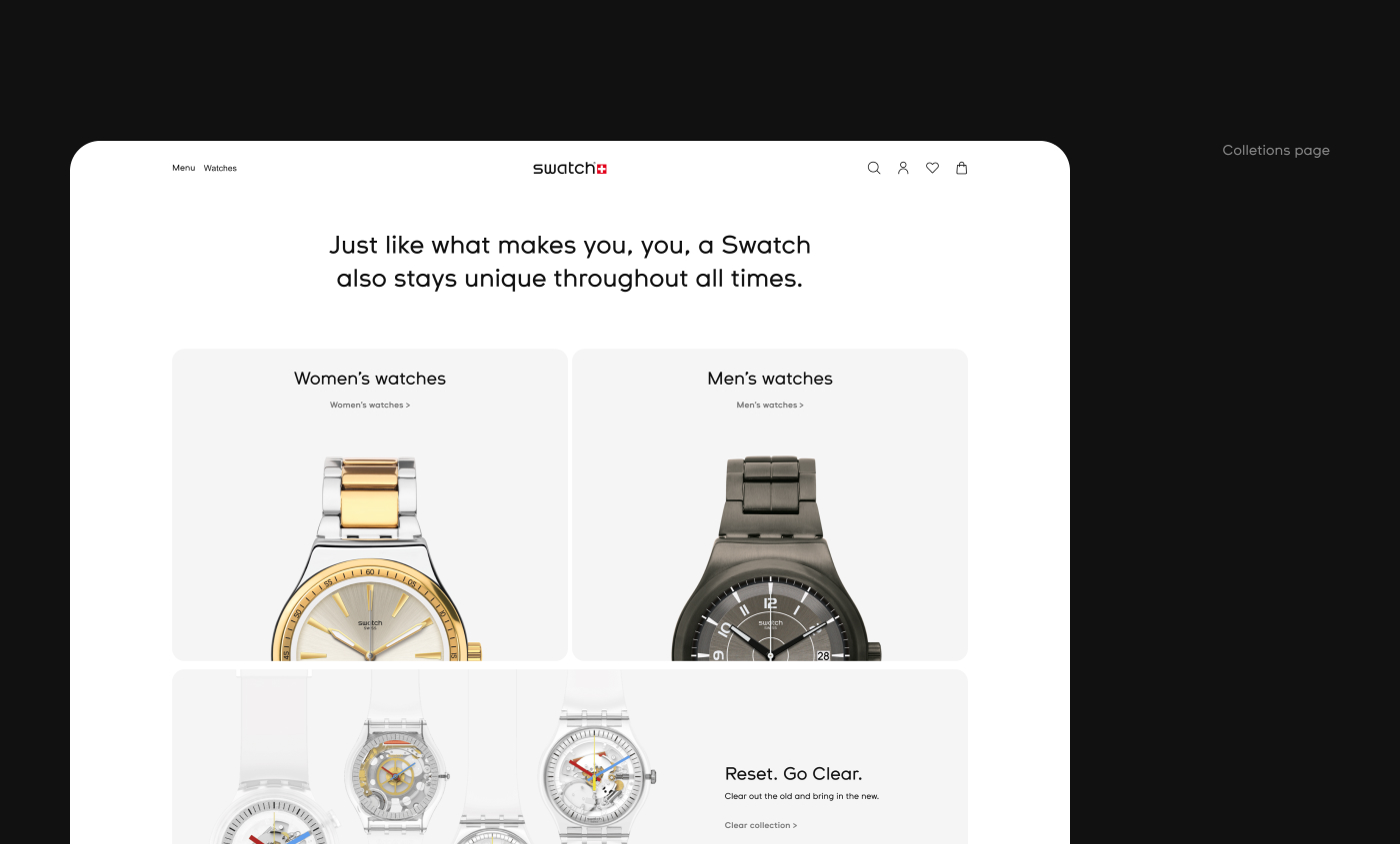
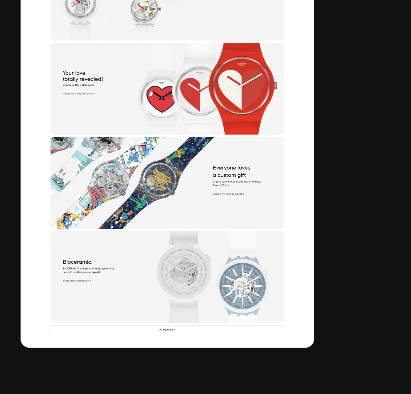
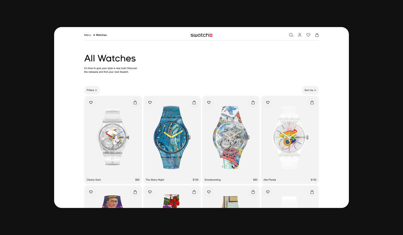
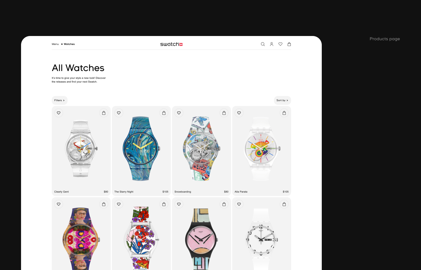
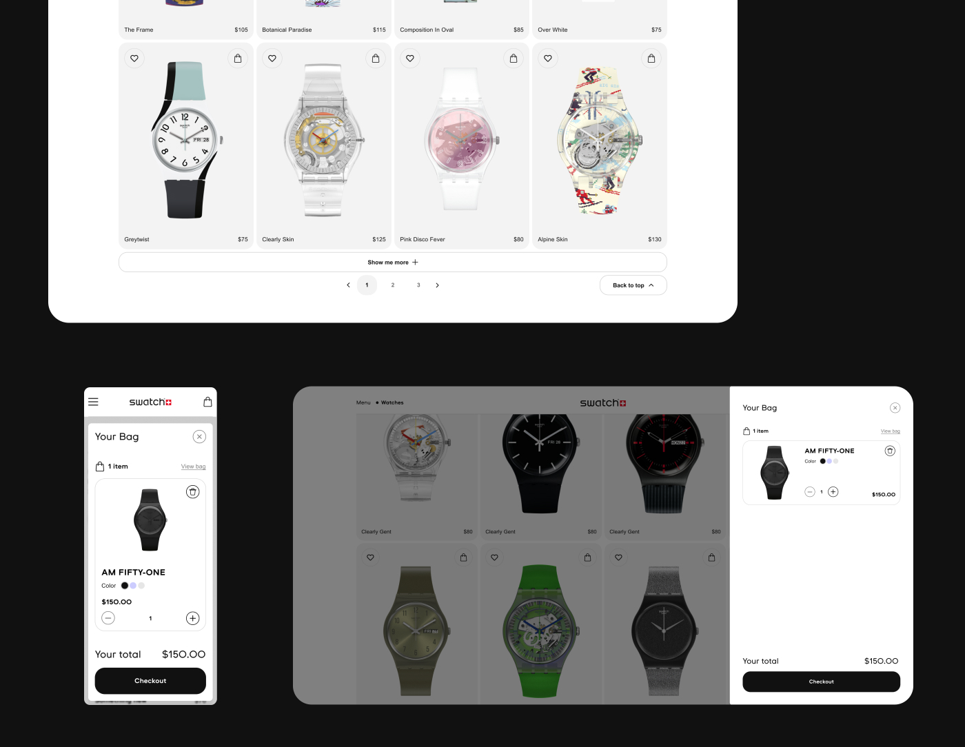
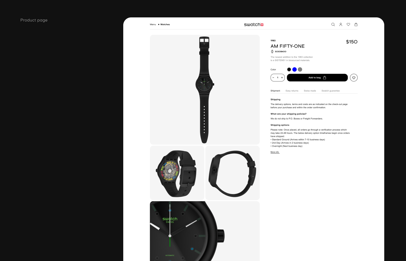
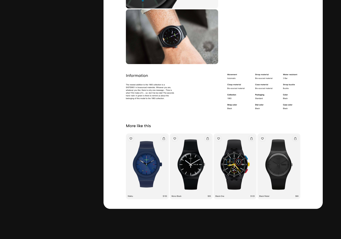
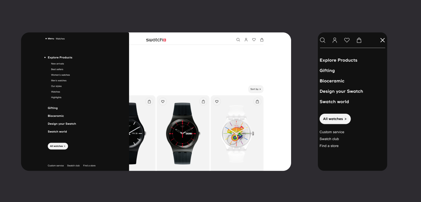
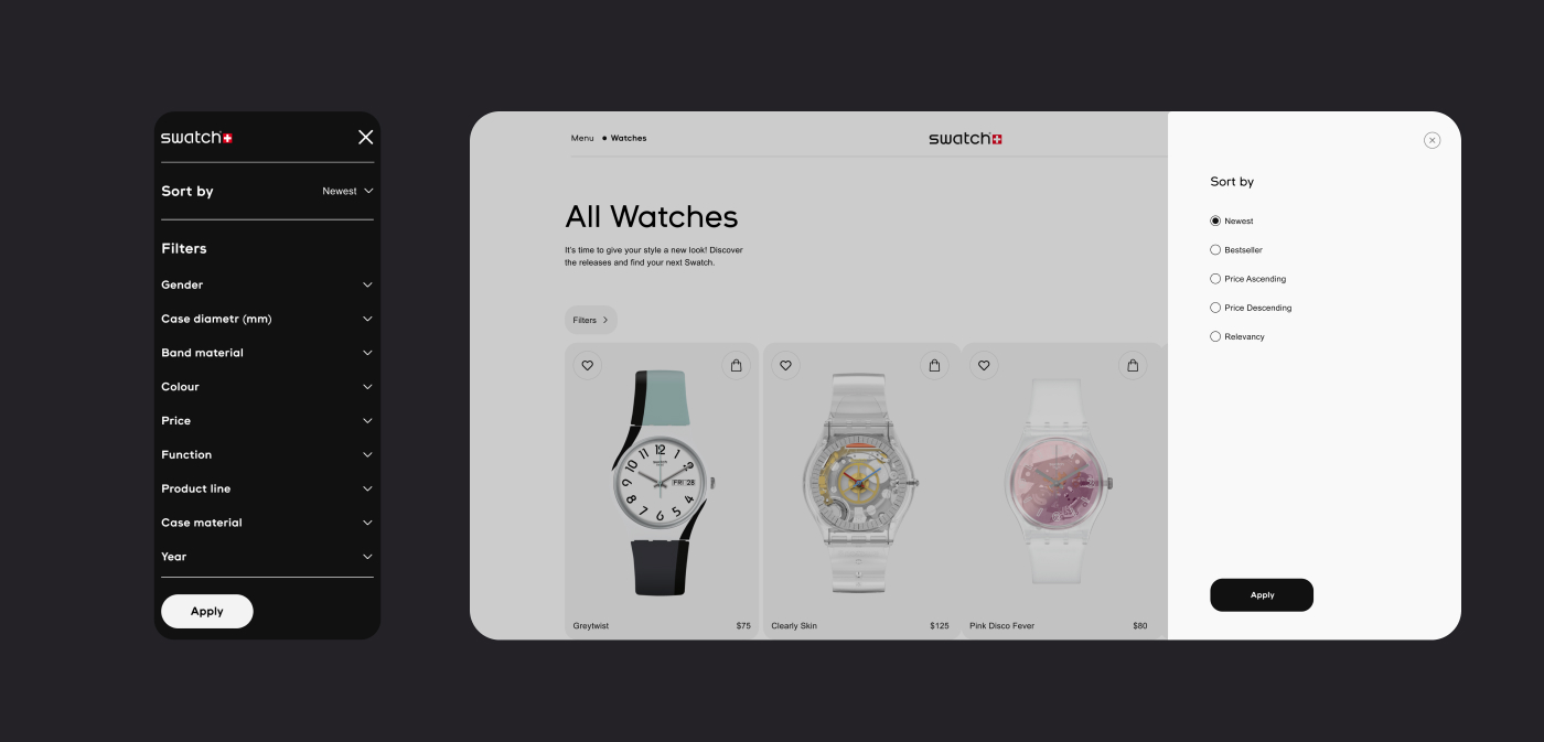
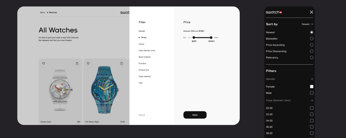
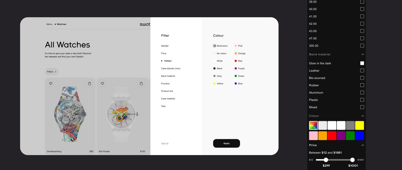
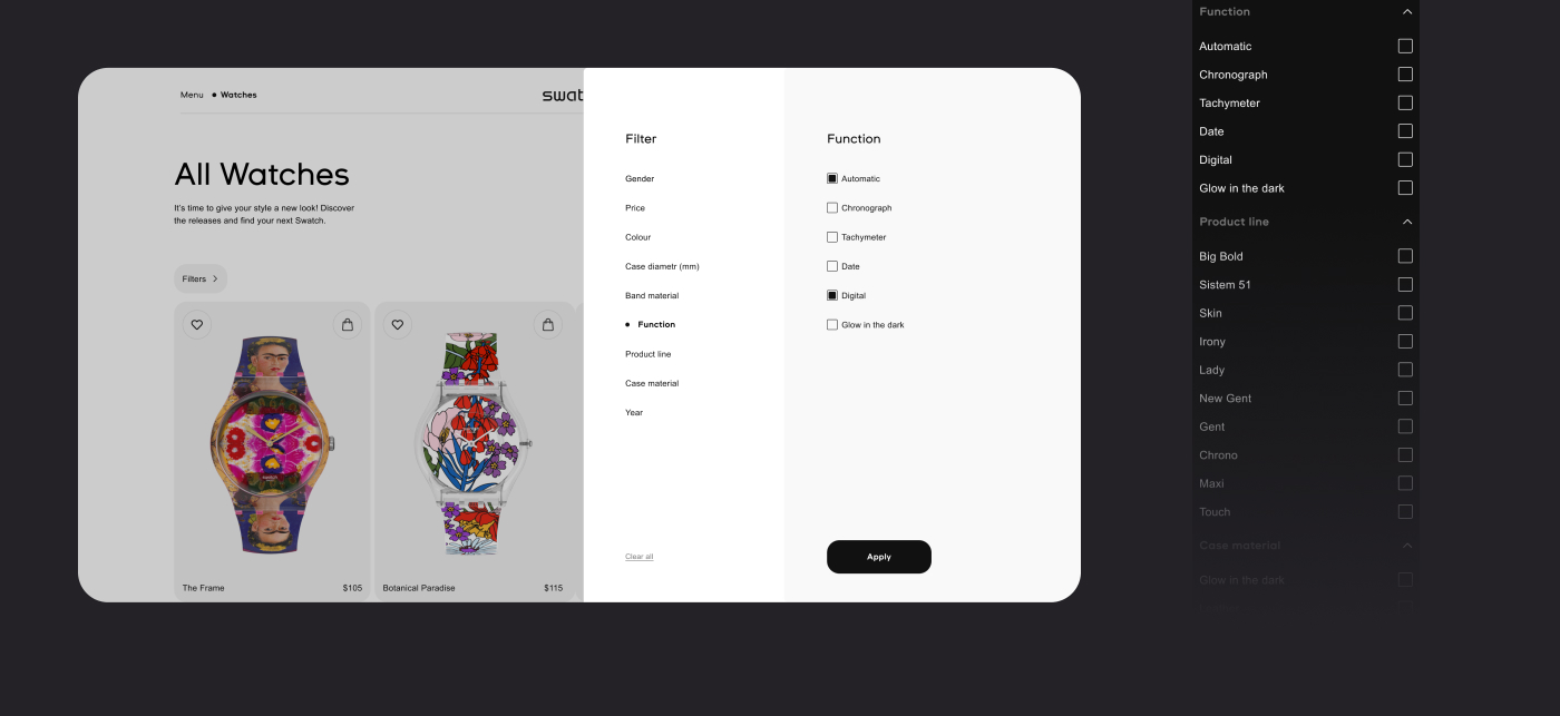
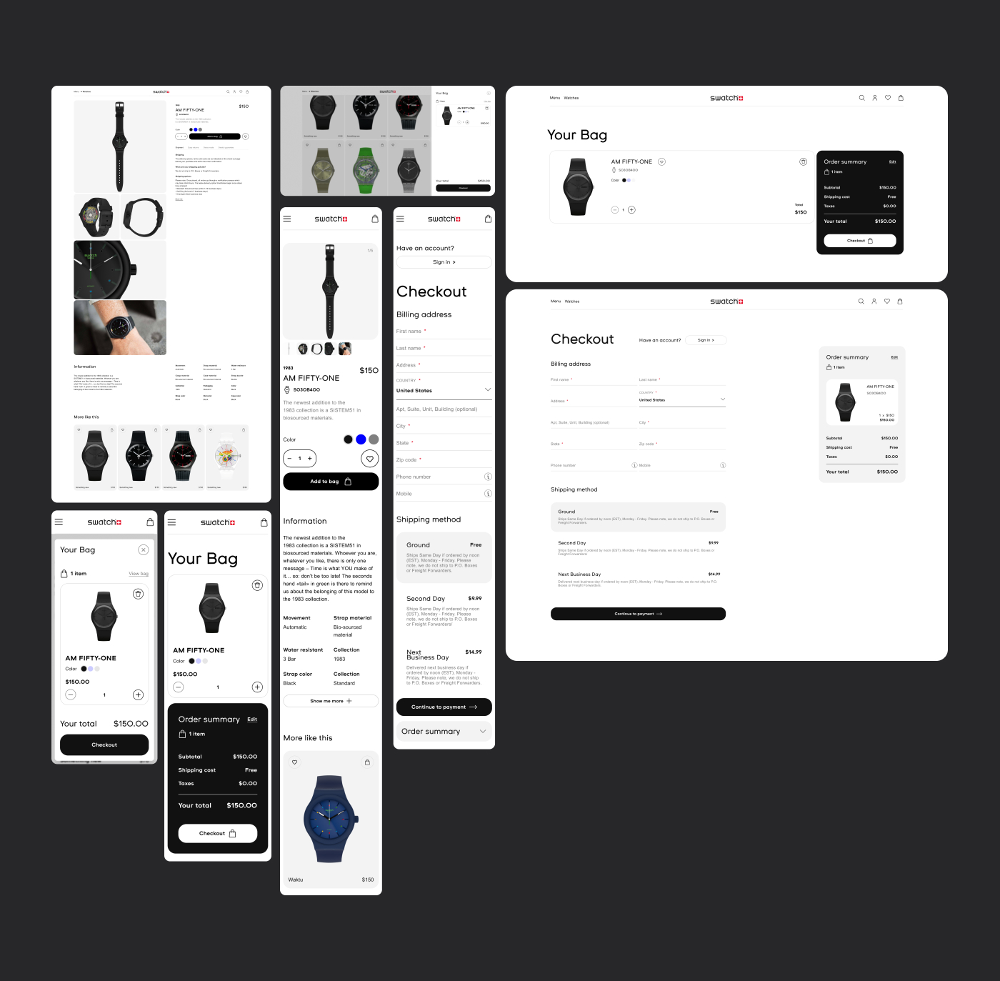
I've bought swatch watches recently and thought to make a redesign of its website. I found current website old with a bit hard user flow.
What i did: — Primary navigation is much simplifyed and Improved on whole website to get customer find what is needed faster and easy; — Filters in product lists are upgraded on the all devices; — Main landing buttons such as "all watches" added; — "Bag" has new page, not just alt window; — Interface inputs are simplifyed . For example, "Checkout" page; — The design system has been improved, less colours, more attention at the main information and landing links.